Posts

Representation of feminist adverts

Image
  The, 'Get the power' advertisement can be seen as an attempt at representing women as a powerful gender, suggesting women have power over their life, and possibly even men. The image of the women with her biceps out is a picture that is used worldwide to spread the power of women and to make women feel independent, it could be seen as a message to women in general, to tell them they can stand up for themselves. The image is a mid-shot which may have been used to focus the audience on the biceps and the 'power' of the woman. The colours red and blue are quite powerful colours and are not stereo-typically 'girl' colours such as pink. On the other hand, it could be seen as sexist towards women and patriotic as the thing women have power over are cleaning products, following the stereotype of women having to do all of the cleaning around the house hold. The, 'this girl can' advertisement is showing girls to have more power than they are seen to h...

Representations in Advertising

Image
Feminism: Consumerism: Celebrity Culture: Multiculturalism: Changing attitudes to sexualities: Postmodernism:

Representation and Stereotypes

Image
How May is represented: This front cover of The Daily Mirror shows Theresa May to be almost a joke, as the Daily Mirror has very left-wing ideologies, this can almost be expected and will be brought by left-wing supporters. The caption, 'PM FLIP-FLOPS AGAIN' shows May to be indecisive and possibly implying that she should not be trusted. Additionally, 'Mrs U-turn' again shows May to be indecisive, the rhetorical question positions and encourages the audience to disagree with May's choices. There is very little copy on the front cover, this decision may have been made so the audience cannot really argue with the Mirror's headlines and ideologies as they are negative about Theresa May from the very beginning. The image used of Theresa May is very unflattering, similarly, satire is used to show May as a joke as well as her decisions and ideologies.  The Sun newspaper does not have a specific ideology, it tends to go with what is most popular at the time, mos...

Old Spice Fresh Places Analysis

Image
The whole ad is a visual metaphor as the brand ambassador is wearing the Bahamas, relating to the scent of the product. The same man is used for the Old Spice adverts, and is now seen as the new old spice brand ambassador. He maintains direct eye contact with the audience/ camera, showing himself to be a dominating, masculine person which is again emphasised with the half- smile. He is also shown to have a good muscular physique, perhaps encouraging women as well as men to buy the product, aspiring to look similar to the face of the product. Resulting in a larger target audience and increasing sales as, stereotypically, women tend to do the shopping. The brand ambassador wearing the Bahamas on his body offers an element of the male gaze, a women in a bikini is laying on the beach (his chest) which may attract a certain audience, and as a result will encourage more men to wear the scent to become more appealing to potential parteners. Additionally, the humour used, ‘this fact is not fa...

Music Video Textual analysis

Image
Singala- sweet lovin' The video is filmed in the streets of America, it has a high beat that is easy to dance to. The red smoke gives the feeling of being alive. The colour may resemble expressing yourself. The clothes of the characters are fairly mainsteam and stylish and are dressed for summer time. The summer and weather tends to make people happier which may be why it has been used, as people watch the video they enjoy it just as they enjoy summer and hot weather. The character also skates to the beat of the music, when the beat gets faster so does her skating, the music is more focused on the beat to the lyrics as it gives off good vibes to the listeners. All the characters in the video seem to be strangers at first who mix and mingle together through dance and to the best if the music. MK-17 The music video is filmed in a fairly poor area, in the streets, all the characters seem to be at the same position in their life. The clothing they wear is loose and comfortabl...

Close the loop copy evaluation

Image
Our group completed this film with some organisations skills, we could have been more organised with when we were filming, and the props we used. Some of the locations we used were improvised and could have been planned for a more accurate representation of the close the loop video. The clips were distributed evenly between the group and some were filmed in class as well as outside of school. The editing and audio were sorted out as a group whilst we were together so we all had equal input on how the video should look at the end. We used our phones to record the clips which did not necessary have the best quality, if we were to do it again we would use a camera to up the quality of the video. We would also film all the clips landscape rather than portrait if we were to film it again so all the clips match the original close the loop video. Our group were quite creative and imaginative with the shots and the props to match the original video as close as possible. For example; the, ...

preliminary production evaluation

Image
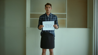
The close the loop video was filmed landscape behind a wall with different shades of colour, the background is quite plain which may have been used to draw all the attention towards to message on the sign and the man. This is why the copy was filmed in a plain background, to match the message of the original video, however the location is not correctly matched. The copied video was videoed portrait when it should have been videoed landscape, to match the original. However, it doesn't seem as though there was a specific reason the video was filmed landscape as opposed to portrait. The facial expressions of each of the men are slightly different as the original was filmed with a worried facial expression on the man, whereas the copy was filmed with a different facial expression as it was uncontrollable. The lighting is not obviously different however, the lighting of the original is focused on the man's face which is different to the copy as his face looks dark as ...